Posterist
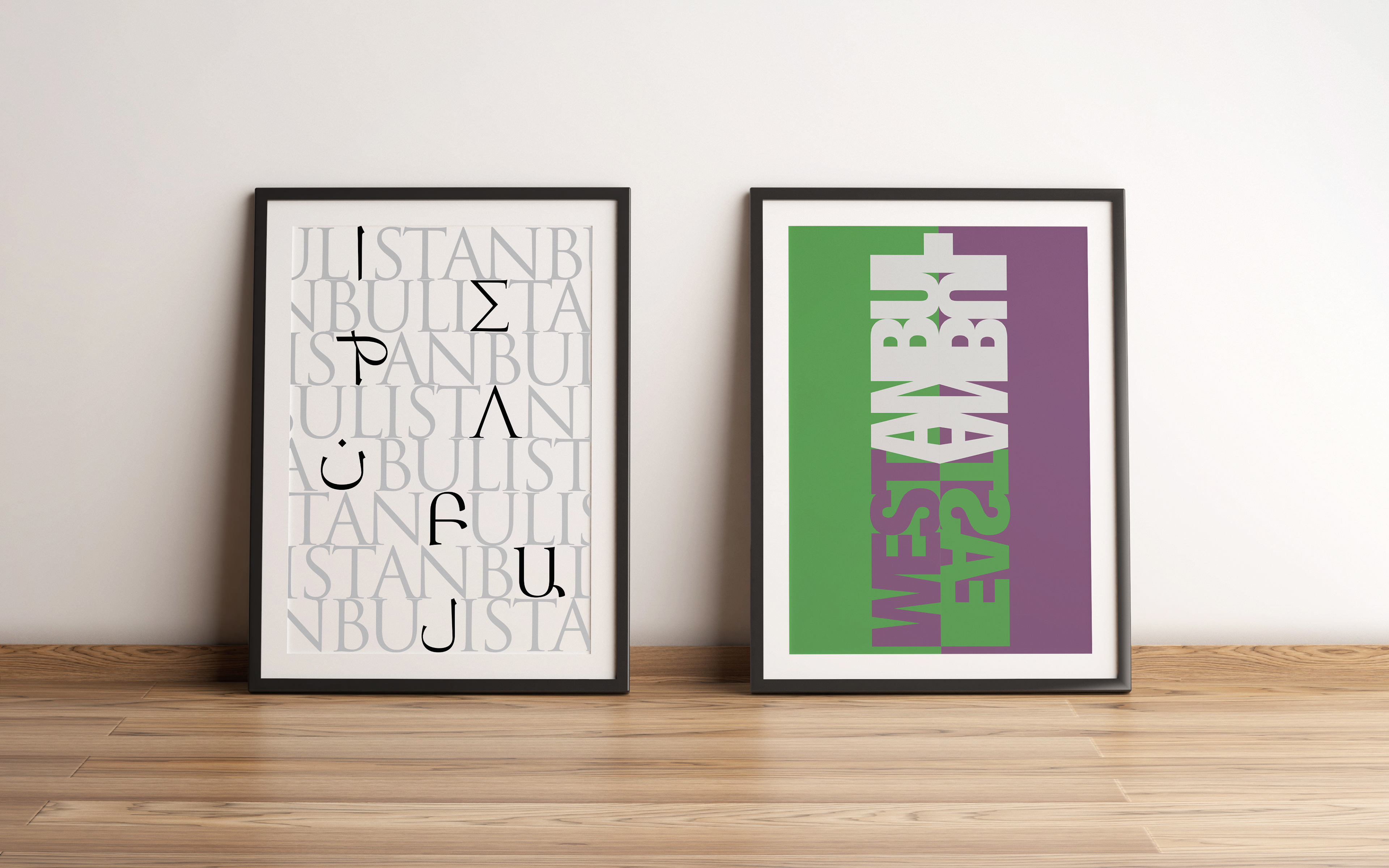
İstanbul Poster Design
In the design on the left, a composition is created using the major alphabets that can be seen in Istanbul, which has hosted many civilizations. Some letters were removed from the repeated "Istanbul" writings written in the Latin alphabet and the corresponding letters of the Greek, Arabic and Armenian alphabets were placed in their places.
In the design on the right, it is tried to tell the story of the meeting of opposites in Istanbul, like the meeting of East and West, Byzantium and Ottoman Empires. To give the perception of East and West, the words "Westanbul" and "Eastanbul" were placed vertically, and the spacing was kept low to reflect the complexity and congestion of Istanbul. To emphasize the West, the color "Byzantium", which symbolizes Byzantium and is also named after it, was used. To emphasize the East, the color green, which is often seen in Ottoman flags and Islamic culture, was used. The Byzantium and green colours used are also complementary colours that are located opposite each other on the colour wheel, just like the East and the West are opposites of each other.

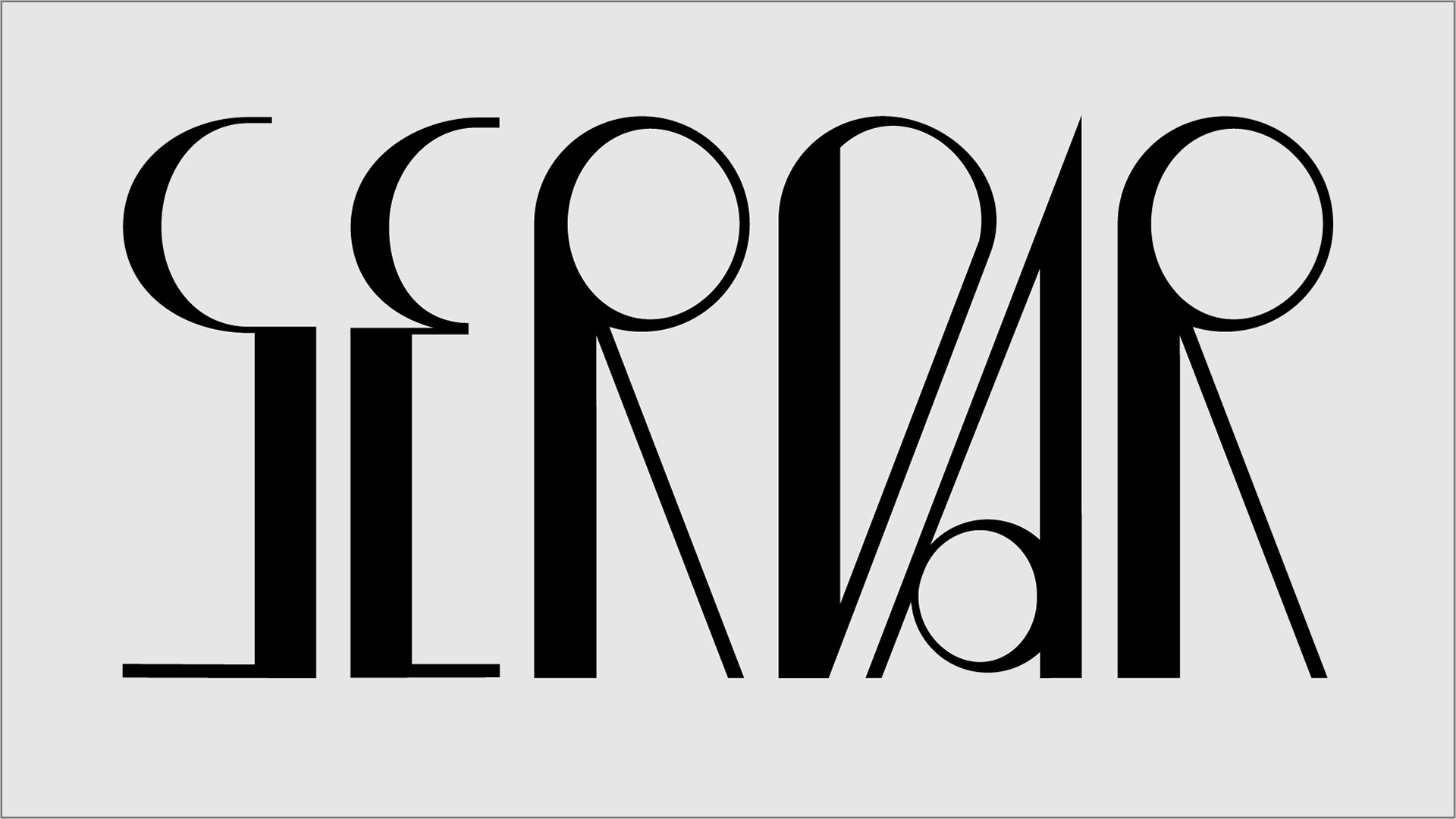
Logotype Re-design
This project proposes a logo redesign framework for evolving brands using typography. In stage one, a type-based brand will undergo a fictional "refresh," exploring new logotype variations through sketches while considering the brand's context and goals. Stage two evaluates these sketches, selecting the best and crafting a clear explanation of the chosen typography, color palette, and design rationale. Finally, the project culminates in a digital sheet showcasing the refreshed logo on mock-ups and explaining the transformation. This project showcases how effective logo redesigns can adapt and revitalize evolving brands through the power of typography.
Word-Meaning
Word-meaning project is a project that creates typographic designs that reflect the meanings of words

Type Cooker Practice
Type-cooker project is a project where specific letters are designed according to randomly selected typographic parameters on typecooker.com.
Contrast Type: Expansion
Contrast Amount: Quite some contrast
Weight: Bold
Width: Condensed
Construction: Capitals
Stroke Endings: Straight, no serif